Heatmapping 101: What It Is and Why You Need It
Written by Joshua Makin
Have you found you’re succeeding in driving users to your website, yet you’re not seeing the sales/leads? Perhaps you can’t figure out why time on site is so low? Or why percentage bounce rates are high above industry benchmarks?
If this sounds at all familiar, we’re willing to bet that you’ll find great use from something called heatmapping – it could potentially be the difference between gaining or losing a customer to a competitor.
When it comes to digital marketing, some – certainly not us – might see the process of getting a user to the page (see our comprehensive guide to improving CTR) as the only factor at play. Yet, this only unlocks a small piece of the consumer puzzle.
Instead, it’s paramount to take an all-encompassing approach to your target user, ensuring that all facets of the user journey are covered. This includes understanding exactly how users are interacting with your website. Or more significantly, what pain points and design choices are causing them to not interact with your site.
While traditional analytics tools such as Google Analytics 4 provide valuable metrics about page views and traffic sources, they often leave crucial questions unanswered with regards to on-page engagement. This is where heatmapping comes in.
What Is Heatmapping?
So, what exactly is heatmapping and how can it be used to optimise both user experience and subsequent conversion rates?
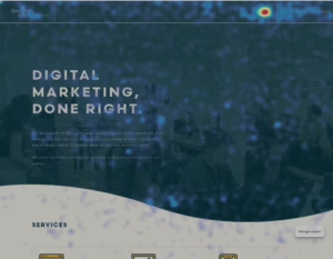
Heatmap software is essentially a tool that allows website owners to visualise where and how users interact with a webpage at both site wide and page level.
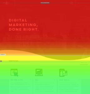
As you can see in the example below, these tools use different colour-coded maps to visualise user behaviour and engagement for all areas of a webpage. This makes it a fantastic tool for A/B testing the impact of any changes made.
The “hotter” (red, orange) areas showcase high levels of activity (this can range from most clicked areas, movement, or scrolling depending on the report you are using), while “cooler” (blue, green) regions indicate lower interaction. These insights reveal what visitors pay attention to, what they ignore, and how they navigate site elements.
The icing on the cake?
Heatmapping can be beneficial to any digital marketing discipline that utilises a landing page.
So while it can greatly benefit SEO and all pages on a website, the analysis can also be targeted to PPC or paid social landing pages to ensure you are optimising the user journey for those potential customers beginning their journey at a lower point of the funnel. You can also use this to gauge how your site user behaviour changes depending on where they are in their purchase journey.
Some heatmapping platforms even let you (although it’s worth noting that many of these will require a monthly payment) split tracking and session recordings by channel for more granular heatmapping analysis.
Types Of Heatmapping
Before diving into the data, let’s first discuss the different types of heatmapping reports so you know exactly what to look for:
Click Maps
Click maps monitor and highlight exactly where a user has clicked or tapped on a page (depending on if you’re analysing mobile or desktop data). They highlight which links, CTAs, navigational elements, and images are being interacted with on the page. You can use the click mapping to:
- Highlight responsiveness pain points – i.e. rage clicks on non-interactive elements.
- Identify user hierarchy of importance and amend any conversions or clickable links which aren’t driving engagement.
- Spot underperforming or ignored elements, revealing pages or features that users overlook, which may lead to missed opportunities for conversions.
Movement Maps
While similar to click mapping, movement maps instead focus on the entire user experience on a page, highlighting exactly where a user is moving their cursor. As user behaviour will generally see mouse movement to areas they are viewing/reading, this can be a great way to identify the exact areas of a page that users are engaging with and which areas they aren’t.
As movement mapping is dependent on a cursor, the analysis is for desktop analysis only.
Movement maps can:
- Help uncover confusing UX elements or areas of a page that are driving greater engagement that you wouldn’t otherwise expect.
- Highlight if headlines, images, or call-to-action buttons are drawing attention as intended, letting you validate whether your design is guiding users down the right path.
- Provide insights on important areas below the fold that are/aren’t driving user attention. Based on this you can move elements of a page up or down accordingly.
Scroll Maps
Scroll maps on the other hand provide insight to just that – how far a user scrolls below the fold (the fold being the dividing point where content can be seen to where a user has to scroll downward). These sorts of heatmaps essentially highlight where user interest on a page begins to drop for the majority of users. Scroll maps can be used for desktop, mobile and even tablet analysis.
Scroll maps allow you to:
- Determine if something on a page (be it an image, a CTA or a clickable link) needs moving up the hierarchy
- Determine above and below the fold content engagement.
- Compare scroll depth with click and move heatmaps to optimise content layout and user flow.
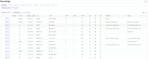
Session Recordings
Why not technically ‘heatmapping’, we thought it silly not to include the fact that many platforms and tools also allow for session recordings (sometimes requiring additional payment but not always). This allows you to see live examples of exactly how real users are interacting with the site. These allow you to:
- Understand the context behind user behaviour identified from the above types of user mapping.
- See live engagement examples that can identify intent between channels.
- Identify how users are reaching particular pages on a site and how easily they are able to do this.
Benefits Of Heatmapping
Still not convinced on the heatmapping phenomenon? Below we have included some of the core benefits gained from setting up and regularly analysing heatmap data.
Real Time User Data:
Heatmap tools allow businesses to monitor and analyse visitor behaviour both as it happens and at a much more granular level than ever before.
Besides just being really interesting, (in our opinion) the immediate insight enables marketers and web managers to quickly identify issues such as user drop-offs, navigation problems, or confusing page elements, and optimise as required. This might include adjusting messaging, offers, or layouts based on the live user feedback.
Improve Cross-Device User Engagement:
Heatmaps go beyond the raw numbers to reveal specific patterns, showing exactly how users navigate and engage with content. Insights such as which images or buttons draw the most attention enable marketers to tailor content placement, messaging, and design to user preferences. This granularity supports smarter segmentation, personalisation, and content strategy adjustments, elevating campaign relevance and effectiveness.
By visually showing where users click, scroll, or hesitate, heatmaps identify UX flaws such as dead zones, distracting page elements, or poorly placed navigation. This enables marketers and designers to refine layouts, reduce clutter, and sharpen user journeys, resulting in smoother, less frustrating interactions that keep visitors engaged longer. Improved UX also contributes to higher retention and repeat visits.
Smarter Experimentation:
As previously mentioned, heatmapping is your secret weapon for successful landing page experimentation, regardless of the digital marketing channel.
This is because – unlike traditional analytics which can be abstract or challenging to interpret – heatmaps clearly display behavioural interaction with a page/site and highlight the smallest of pain points. Using this you can make and see the direct impact of small or large landing page changes.
Cross Data Pairing:
Heatmapping data can easily be paired with other analytical tools for additional relevant and insightful analysis.
For instance, if you’re using the Google Analytics 4 landing page report and notice that either a page type (e.g. category pages) or specific page (e.g. homepage) has a much higher bounce rate or lower time on site than the average you expect, then heatmapping can provide direct context and reasoning beyond what the standard GA4 platform provides.
It’s this granular insight at page level that allows for quick issue identification and fixing which would otherwise be much harder to diagnose.
Putting it all Together
At the end of the day, your website and its key landing pages are the cornerstone of digital marketing success, regardless of the marketing channel. Heatmapping allows you to build a more coherent and optimal user experience and it is for this reason that it should never be overlooked.
Looking to find out more about how you can utilise heatmapping for your business? Get in touch with our team for a free digital audit.
Frequently Asked Questions
What are the common heatmapping mistakes?
While heatmapping is a great way to troubleshoot and optimise user experience, there are a handful of even mistakes that agencies can make that lead to inaccurate conclusions.
- Relying on Too Little Data: Heatmaps based on a small sample of visitors can mislead. Always gather enough sessions (hundreds or thousands, depending on traffic) before drawing conclusions.
- Treating Heatmaps as Absolute Truth: A heatmap shows what users do, not why they do it. Pair heatmap insights with session recordings, surveys, or analytics for a complete picture.
- Ignoring Mobile Behaviour: Many teams only review desktop heatmaps, forgetting that most traffic is mobile. User behaviour often looks very different on small screens.
How to create a website heatmap?
While each heatmapping tool with have a slightly different installation process, most will give you a custom piece of HTML which can easily be implemented through Google Tag Manager. For specific instructions, please visit the relevant tool website for guidance as applicable.
What are some of the most popular heatmapping tools?
While it might seem tempting to just jump in on any heatmapping tool, there is no one size fits all platform.
Each have distinct advantages over one another and it’s important to know these as well as the pricing and company size/traffic tracking capabilities before making a decision. Below are some of the most used tools on the market.
Hotjar
Hotjar is a very popular all-in-one behaviour-analytics tool that includes heatmaps, session recordings and surveys aimed at making user behaviour visible. The access and features are dependent on the pricing tier chosen.
Pricing:
While there is a free plan available, this only provides tracking for a limited number of sessions (good for small websites but limited for enterprise sized sites.
Paid plans start at $40 (around £35 per month) although can scale up to thousands of pounds per month for the enterprise tier package.
Crazy Egg
Crazy Egg is a more streamlined market tool that emphasises heatmaps, scroll-maps, recordings and A/B testing to help optimise page layouts & conversions.
Pricing:
While there is no free tier like other platforms, the introduction tier is slightly cheaper than competitors at around $30 (£23), allowing for limited report tracking but unlimited domains to be analysed. Prices scale up between $99 (£69) and $599 (£455) depending on the number of pages, heatmap repots and recordings you want to have access to.
Lucky Orange
Luck Orange is a conversion-focused platform offering session recordings, dynamic heatmaps, surveys and live chat, for smaller, mid-sized and enterprise sites.
Pricing:
Lucky Orange offers a slightly more granular list of options, with 6 tiers ranging from free to enterprise size. Unlike other platforms, they focus their tiering on 2 sole factors, the number of monthly sessions you can track and the number of days with which the heatmap data can be stored (with each scaling up depending on the tier chosen). There is also a 30-day free trial available for all paid tiers.
Mouseflow
Mouseflow is a behaviour-analytics platform focusing on full-session replay (every click/scroll), heatmaps, funnels & form analytics to uncover user friction.
Pricing:
Mouseflow offer 5 different tiers ranging from free to Enterprise (£500+). Unlike Lucky Orange, tiers are split by monthly sessions, project domains, and types of heatmaps accessible.